Award Winning
Web Design Agency
Inspire and Engage
Web Design & Development
We’re an award winning web design agency with a specialised team of designers, engineers and strategists. It is our belief that every website should be a joy to behold and a dream to use on any device. Crafted with pride, we deliver stunning WordPress sites that engage customers and accelerate growth.
Conception to Completion
Our Process
Our web design team will manage your project from conception through to completion – developing early-stage ideas into wireframes and then visual design concepts before taking these through build, test and launch phases. Working independently or collaborating with a client’s in-house team, or other 3rd parties, we can confidently manage complex projects or provide technical expertise and support.

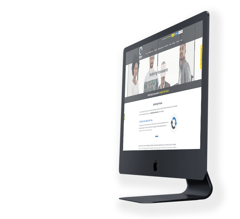
Success Stories
Web Design Agency


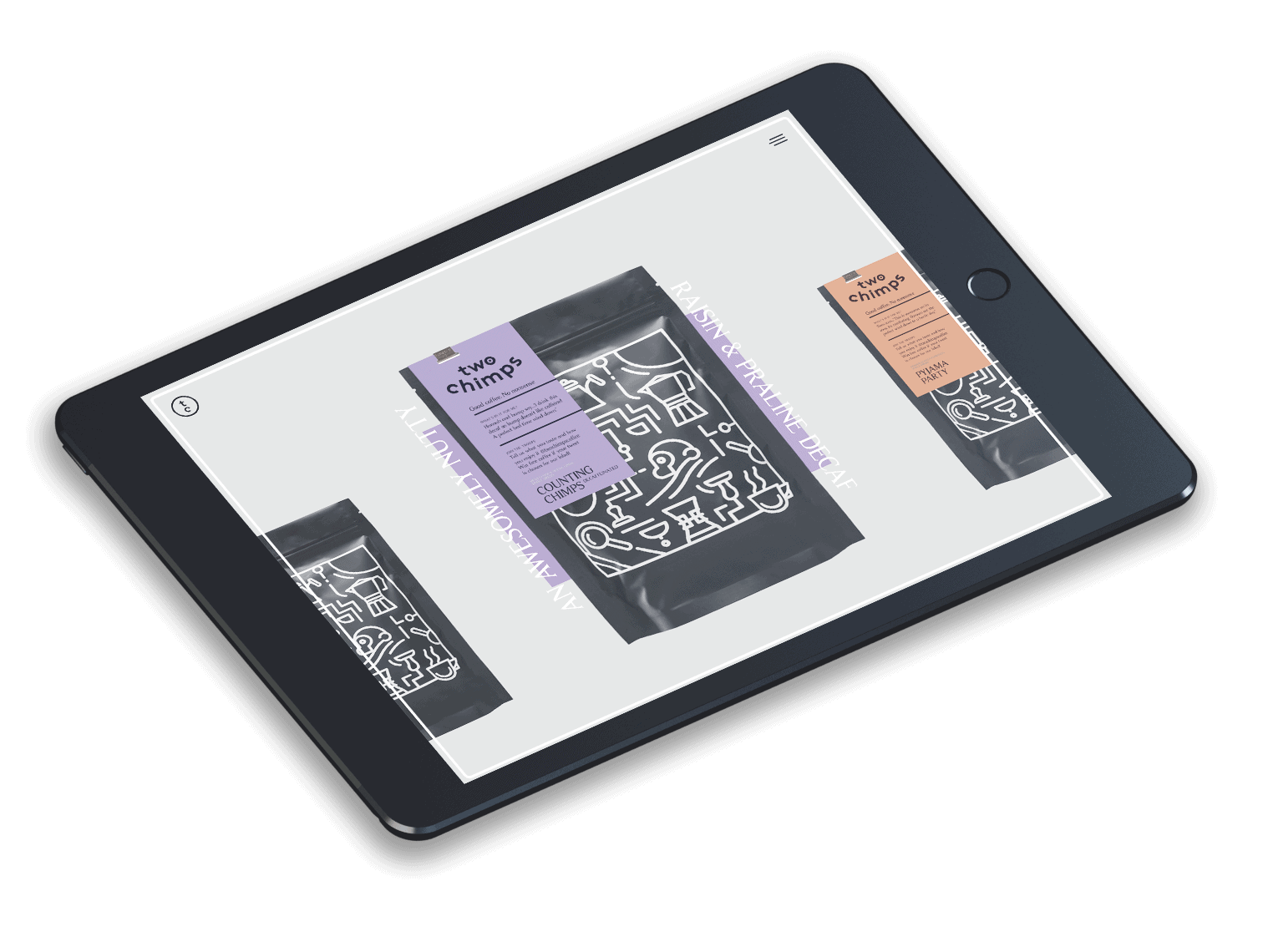
Pixel-Perfect
Web Design Agency
The web is a highly competitive marketplace where organisations have new and exciting opportunities to communicate with their audiences like never before. It’s no longer acceptable for brands, retailers and other businesses to simply ‘have an online presence’. To succeed, businesses need to work with an award winning web design agency who can exceed their goals.
From our HQ in Leicester, We strive to achieve an exceptionally high standard in every project we deliver. Our talented web design team work closely with our clients to devise exciting, innovative ideas to keep them ahead of the competition. We relish technical challenges and settle for nothing short of pixel-perfect.